Clinic websites · Perth
7 website mistakes that cost Perth clinics new patients
Why does a patient who found your clinic on Google still book with the practice next door?
 Alexander Zhdanov · · 3 min read
I have visited every country in the world, and in most of them I have had to find a doctor in a hurry, on a phone, in a language I did not always speak. You learn quickly which clinic websites help you and which ones make you give up. Now I live in Perth and audit websites for a living, and I see the same seven mistakes on clinic sites here again and again. Let me walk you through them one by one.
Step by step
Booking is hidden or missing
Many clinics already pay for HotDoc, HealthEngine or AutoMed online booking, but the website only shows a phone number. A “Book online” button should sit in the header of every page and stay visible on a phone as you scroll.
Opening hours are hard to find
Hours are often buried in the footer or on a separate page. A small live “Open now · until 6 pm” line at the top answers the first question every patient has.
The phone number is not tappable
On a phone the number has to start a call with one tap. A number inside an image or plain text that cannot be tapped loses calls every week.
No fees, no bulk billing information
Patients want to know before they book: is it bulk billed, what is the gap, is there a fee for a long consultation. A short, clear fees table saves the reception many calls.
Doctors without faces
People choose a person, not a building. A photo of each GP, the languages they speak and what they enjoy working with (women’s health, kids, skin checks) help patients choose and book straight away.
Heavy pages that are slow on a phone
Large photos and old templates make pages slow on mobile data. A fast site keeps people on the page and also helps it rank on Google.
Reviews that break AHPRA rules, or no reviews at all
Under AHPRA advertising rules a clinic may only show testimonials that are complete and do not mention clinical aspects such as symptoms, treatment or outcomes. Many sites either break this rule or show nothing. A safe option is non-clinical reviews plus a link to the Google rating.
Concept · our vision
Example: a concept for Shelley Hub Family Practice
Shelley Hub Family Practice is a family GP practice in Shelley, Western Australia. I audited its public website and built a concept to show what it could be. This is my vision, not the clinic’s official website.
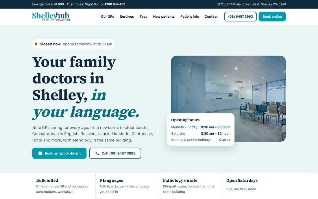
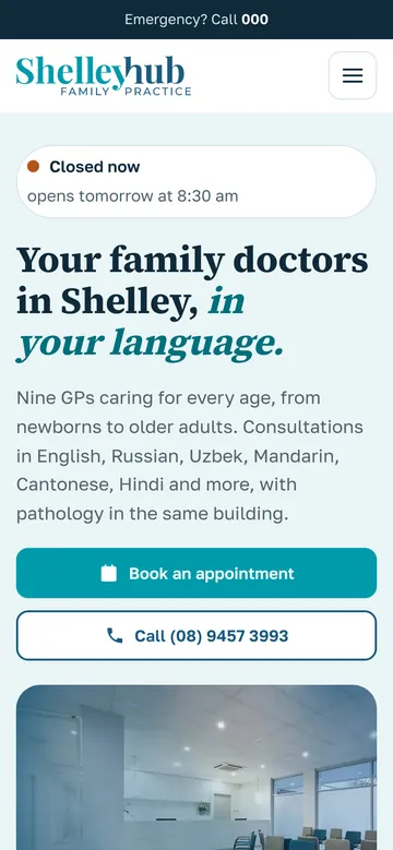
- A live “open now / closed” status in Perth time
- A doctor finder by language (including Russian and Uzbek) and by need
- One-tap booking with each GP
- A clear fees table and an after-hours block with emergency numbers
- Wording that follows AHPRA advertising rules
- Fast pages that work well on a phone
The bottom line
A clinic website does not need to be clever. It needs to answer four questions in ten seconds: can I book, when are you open, how much will it cost and who will I see. Fix the seven mistakes above and the same traffic you already have starts turning into appointments.
Alexander Zhdanov
Digital Media Marketing Specialist · AK Digital Media
- Every countryvisited them all
- 8 booksabout the journeys
- NIT, Perthstudied in Perth
I live in Perth, so I look at clinic websites the way a patient here does: on a phone, in a hurry, wanting to book.
I audit and design websites through the eyes of someone who has seen how businesses welcome customers in every country on earth.
Want the same for your clinic?
Send us your website address. Within 24 hours you get a Word audit of your current site and a new design on a link you can open on your phone. No passwords needed.